前端面试 10个css高频面试题
# 1. BFC 机制
BFC(Block Formatting Context),块级格式化上下文,是一个独立的渲染区域,让处于 BFC 内部的元素与外部的元素相互隔离,使内外元素的定位不会相互影响。
- 触发条件 (以下任意一条)
- float 的值不为 none
- overflow 的值不为 visible
- display 的值为 table-cell、tabble-caption 和 inline-block 之一
- position 的值不为 static 或则 releative 中的任何一个
在 IE 下, Layout,可通过
zoom:1触发
.BFC 布局与普通文档流布局区别 普通文档流布局:
- 浮动的元素是不会被父级计算高度
- 非浮动元素会覆盖浮动元素的位置
- margin 会传递给父级元素
- 两个相邻元素上下的 margin 会重叠
BFC 布局规则:
- 浮动的元素会被父级计算高度(父级元素触发了 BFC)
- 非浮动元素不会覆盖浮动元素的位置(非浮动元素触发了 BFC)
- margin 不会传递给父级(父级触发 BFC)
- 属于同一个 BFC 的两个相邻元素上下 margin 会重叠
开发中的应用
- 阻止 margin 重叠
- 可以包含浮动元素 —— 清除内部浮动(清除浮动的原理是两个 div 都位于同一个 BFC 区域之中)
- 自适应两栏布局
- 可以阻止元素被浮动元素覆盖
# 2. CSS3 中新增的选择器以及属性
这里只是列出来, 具体的使用,请查看我的关于 css3 新增选择器与属性文章
- 属性选择器
| 属性选择器 | 含义描述 |
|---|---|
| E[att^="val"] | 属性 att 的值以"val"开头的元素 |
| E[att$="val"] | 属性 att 的值以"val"结尾的元素 |
| E[att*="val"] | 属性 att 的值包含"val"字符串的元素 |
- 结构伪类选择器
| 选择器 | 含义描述 |
|---|---|
| E:root | 匹配文档的根元素,对于 HTML 文档,就是 HTML 元素 |
| E:nth-child(n) | 匹配其父元素的第 n 个子元素,第一个编号为 1 |
| E:nth-last-child(n) | 匹配其父元素的倒数第 n 个子元素,第一个编号为 1 |
| E:nth-of-type(n) | 与:nth-child()作用类似,但是仅匹配使用同种标签的元素 |
| E:nth-last-of-type(n) | 与:nth-last-child() 作用类似,但是仅匹配使用同种标签的元素 |
| E:last-child | 匹配父元素的最后一个子元素,等同于:nth-last-child(1) |
| E:first-of-type | 匹配父元素下使用同种标签的第一个子元素,等同于:nth-of-type(1) |
| E:last-of-type | 匹配父元素下使用同种标签的最后一个子元素,等同于:nth-last-of-type(1) |
| E:only-child | 匹配父元素下仅有的一个子元素,等同于:first-child:last-child 或 :nth-child(1):nth-last-child(1) |
| E:only-of-type | 匹配父元素下使用同种标签的唯一一个子元素,等同于:first-of-type:last-of-type 或 :nth-of-type(1):nth-last-of-type(1) |
| E:empty | 匹配一个不包含任何子元素的元素,注意,文本节点也被看作子元素 |
- css3 新增属性
| 属性 | 含义描述 | 兼容 |
|---|---|---|
| transition | 设置过渡效果 | |
| transform | 变换效果(移动、缩放、转动、拉长或拉伸) | |
| animation | 动画效果 | |
| box-shadow | 阴影效果 | FF3.5, Safari 4, Chrome 3 |
| text-shadow | 文本阴影 | FF 3.5, Opera 10, Safari 4, Chrome 3 |
| border-colors | 为边框设置多种颜色 | FF3+ |
| boder-image | 图片边框 | FF 3.5, Safari 4, Chrome 3 |
| text-overflow | 文本截断 | IE6+, Safari4, Chrome3, Opera10 |
| word-wrap | 自动换行 | IE6+, FF 3.5, Safari 4, Chrome 3 |
| border-radius | 圆角边框 | FF 3+, Safari 4 , Chrome 3 |
| opacity | 不透明度 | all |
| box-sizing | 控制盒模型的组成模式 | FF3+, Opera 10, Safari 4, Chrome 3 |
| outline | 外边框 | FF3+, safari 4, chrome 3, opera 10 |
| background-size | 不指定背景图片的尺寸 | safari 4, chrome 3, opera 10 |
| background-origin | 指定背景图片从哪里开始显示 | safari 4, chrome 3, FF 3+ |
| background-clip | 指定背景图片从什么位置开始裁切 | safari 4, chrome 3 |
| rgba | 基于 r,g,b 三个颜色通道来设置颜色值, 通过 a 来设置透明度 | safari 4, chrome 3, FF3, opera 10 |
# 3. 居中布局
水平居中 1. 行内元素:
text-align:center2. 块级元素:margin:0 auto3. 绝对定位和移动:absolute + transform4. 绝对定位和负边距:absolute + margin5. flex 布局:flex + justify-content:center垂直居中 1. 子元素为单行文本:
line-height:height2.absolute + transform3.flex + align-items:center4. table:display:table-cell; vertical-align: middle5. 利用 position 和 top 和负 margin水平垂直居中
 1. 已知元素宽高:绝对定位+margin:auto:
css div{ width: 200px; height: 200px; background: green; position:absolute; left:0; top: 0; bottom: 0; right: 0; margin: auto; } 2. 已知元素宽高: 绝对定位+负 margin
css div{ width: 200px; height: 200px; background: green; position:absolute; left:0; top: 0; bottom: 0; right: 0; margin: auto; } 3. absolute+transform
div {
  width: 200px;
  height: 200px;
  background: green;
  position: absolute;
  left: 50%; /* 定位父级的50% */
  top: 50%;
  transform: translate(-50%, -50%); /*自己的50% */
}
2
3
4
5
6
7
8
9
4. `flex + justify-content + align-items`
.box {
  height: 600px;
  display: flex;
  justify-content: center; //子元素水平居中
  align-items: center; //子元素垂直居中
  /* aa只要三句话就可以实现不定宽高水平垂直居中。 */
}
.box > div {
  background: green;
  width: 200px;
  height: 200px;
}
2
3
4
5
6
7
8
9
10
11
12
# 4. 清除浮动有哪些方法, 各有什么优缺点
- 使用 clear 属性的空元素
在浮动元素后使用一个空元素如
<div class="clear"></div>,并在 CSS 中赋予.clear{clear:both;}属性即可清理浮动。亦可使用<br class="clear" />或<hr class="clear" />来进行清理。
优点: 简单, 写少量代码, 兼容性也好 缺点: 添加无语义 html 元素, 不利于代码语义化, 后期维护成本大
使用 css 的 overflow 属性 给浮动元素的容器添加
overflow:hidden;或overflow:auto;可以清除浮动,另外在 IE6 中还需要触发 hasLayout ,例如为父元素设置容器宽高或设置zoom:1。在添加 overflow 属性后,浮动元素又回到了容器层,把容器高度撑起,达到了清理浮动的效果。优点: 简单, 代码少, 浏览器支持好 缺点: 不能和 position 配合使用, 因为超出的尺寸会被隐藏
overflow:hidden使用 CSS 的:after 伪元素 结合 :after 伪元素(注意这不是伪类,而是伪元素,代表一个元素之后最近的元素)和 IEhack ,可以完美兼容当前主流的各大浏览器,这里的 IEhack 指的是触发 hasLayout。 给浮动元素的容器添加一个
clearfix的 class,然后给这个 class 添加一个:after 伪元素实现元素末尾添加一个看不见的块元素(Block element)清理浮动。 通过 CSS 伪元素在容器的内部元素最后添加了一个看不见的空格"020"或点".",并且赋予 clear 属性来清除浮动。需要注意的是为了 IE6 和 IE7 浏览器,要给 clearfix 这个 class 添加一条 zoom:1;触发 haslayout。优点: 浏览器支持好,不容易出现怪问题(目前:大型网站都有使用,如:腾迅,网易,新浪等等) 缺点: 代码多,要两句代码结合使用,才能让主流浏览器都支持
给父级元素设置高度
简单, 代码少,好掌握 缺点: 只适用于高度固定的布局
# 5. 用纯 CSS 创建一个三角形的原理是什么
之前写三角形, 都是直接记住代码,没有探究原因,我也是直到有一次面试时,面试大哥让我说说 css 创建三角形的原理,我就......回来就赶紧翻资料.接下来我就将当时我理解的过程列举出来:
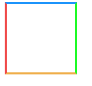
- 写一个我们最熟悉的 border 应用
.box {
  width: 100px;
  height: 100px;
  border: 3px solid;
  border-color: #1b93fb #1bfb24 #efad48 #ef4848;
}
2
3
4
5
6
效果如下:
- 接下来,我们将 border 值增大
.box {
  width: 100px;
  height: 100px;
  border: 50px solid;
  border-color: #1b93fb #1bfb24 #efad48 #ef4848;
}
2
3
4
5
6
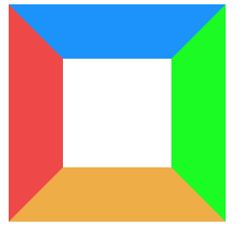
很容易发现, border 渲染并不是正方形, 而是梯形的
- 在增大 border 的基础下, 此时我们将盒子宽高变成 0,会产生什么效果呢!
.box {
  width: 0px;
  height: 0px;
  border: 50px solid;
  border-color: #1b93fb #1bfb24 #efad48 #ef4848;
}
2
3
4
5
6
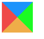
四个三角形拼合成的矩形呈现在我们眼前,那如如果我们只想要一个三角形, 我们是不是可以设想将其他三个设为不可见;
- 设置透明, 隐藏其中三个三角形
.box {
  width: 0px;
  height: 0px;
  border: 50px solid;
  border-color: transparent transparent transparent #ef4848;
}
2
3
4
5
6

三角形这样就出来, 有木有很简单, 当然我们也可以采用逆向思维来写这个效果, 就是先将所有边框设为透明, 然后需要哪边再对其设置颜色, 效果是一样的
.box {
  width: 0px;
  height: 0px;
  border: 50px solid transparent;
  border-left: 50px solid #ef4848;
}
2
3
4
5
6
这样给面试你的人讲,讲明白应该不是问题., 重点就是要理解border的应用
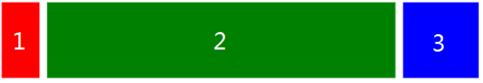
# 6. 实现三栏布局有哪些方法, 分别描述一下
三栏布局,顾名思义就是两边固定,中间自适应。三栏布局在开发十分常见,那么什么是三栏布局? 即左右模块固定宽度,中间模块随浏览器变化自适应,想要完成的最终效果如下图所示:
下面列出四种实现方式, 在开发中可以根据实际需求选择适合自己的方法进行编码:
- Flex 布局
<style>
  .container {
    display: flex;
    justify-content: center;
    height: 200px;
    background: #eee;
  }
  .left {
    width: 200px;
    background-color: red;
    height: 100%;
  }
  .main {
    background-color: yellow;
    flex: 1;
  }
  .right {
    width: 200px;
    background-color: green;
  }
</style>

<div class="container">
  <div class="left">1</div>
  <div class="main">2</div>
  <div class="right">3</div>
</div>
2
3
4
5
6
7
8
9
10
11
12
13
14
15
16
17
18
19
20
21
22
23
24
25
26
27
简单实用,现在比较流行的方案,但是需要考虑浏览器的兼容性。
- 绝对定位布局
<style>
  .container {
    position: relative;
    background: #eee;
    height: 200px;
  }
  .main {
    height: 200px;
    margin: 0 120px;
    background-color: yellow;
  }
  .left {
    position: absolute;
    width: 100px;
    height: 200px;
    left: 0;
    top: 0;
    background-color: red;
  }
  .right {
    position: absolute;
    width: 100px;
    height: 200px;
    background-color: green;
    right: 0;
    top: 0;
  }
</style>

<div class="container">
  <div class="left">1</div>
  <div class="main">2</div>
  <div class="right">3</div>
</div>
2
3
4
5
6
7
8
9
10
11
12
13
14
15
16
17
18
19
20
21
22
23
24
25
26
27
28
29
30
31
32
33
34
这种方案也简单实用, 并且可以将
<div class="main"></div>元素放到第一位,使得主要内容优先加载!
- 双飞翼布局
<style>
  .content {
    float: left;
    width: 100%;
  }
  .main {
    height: 200px;
    margin-left: 110px;
    margin-right: 220px;
    background-color: yellow;
  }
  .left {
    float: left;
    height: 200px;
    width: 100px;
    margin-left: -100%;
    background-color: red;
  }
  .right {
    width: 200px;
    height: 200px;
    float: right;
    margin-left: -200px;
    background-color: green;
  }
</style>
<div class="content">
  <div class="main"></div>
</div>
<div class="left"></div>
<div class="right"></div>
2
3
4
5
6
7
8
9
10
11
12
13
14
15
16
17
18
19
20
21
22
23
24
25
26
27
28
29
30
31
- 圣杯布局
<style>
  .container {
    margin-left: 120px;
    margin-right: 220px;
  }
  .main {
    float: left;
    width: 100%;
    height: 300px;
    background-color: yellow;
  }
  .left {
    float: left;
    width: 100px;
    height: 300px;
    margin-left: -100%;
    position: relative;
    left: -120px;
    background-color: blue;
  }
  .right {
    float: left;
    width: 200px;
    height: 300px;
    margin-left: -200px;
    position: relative;
    right: -220px;
    background-color: green;
  }
</style>
<div class="container">
  <div class="main"></div>
  <div class="left"></div>
  <div class="right"></div>
</div>
2
3
4
5
6
7
8
9
10
11
12
13
14
15
16
17
18
19
20
21
22
23
24
25
26
27
28
29
30
31
32
33
34
35
圣杯布局和双飞翼布局解决问题的方案在前一半是相同的,也就是三栏全部 float 浮动,但左右两栏加上负 margin 让其跟中间栏 div 并排,以形成三栏布局。
# 7. css3 实现 0.5px 的细线
<style>
  .line {
    position: relative;
  }
  .line:after {
    content: '';
    position: absolute;
    left: 0;
    top: 0;
    width: 100%;
    height: 1px;
    background-color: #000000;
    -webkit-transform: scaleY(0.5);
    transform: scaleY(0.5);
  }
</style>

<div class="line"></div>
2
3
4
5
6
7
8
9
10
11
12
13
14
15
16
17
18
# 8. link 与 @import 的区别
- 从属关系区别
@import 是 CSS 提供的语法规则,只有导入样式表的作用;link 是 HTML 提供的标签,不仅可以加载 CSS 文件,还可以定义 RSS、rel 连接属性等
加载顺序区别
加载页面时,link 标签引入的 CSS 被同时加载;@import 引入的 CSS 将在页面加载完毕后被加载。
兼容性区别
@import 是 CSS2.1 才有的语法,故只可在 IE5+ 才能识别;link 标签作为 HTML 元素,不存在兼容性问题。
DOM 可控性区别
可以通过 JS 操作 DOM ,插入 link 标签来改变样式;由于 DOM 方法是基于文档的,无法使用@import 的方式插入样式。
css 部分就整理到这里, 小伙伴们面试还有什么经常遇到的,可以在评论区给我留言, 我有时间就整理出来, IT(挨踢)都是一大家, 方便你我他
# 9. 开发中为什么要初始化 css 样式
因为浏览器的兼容问题,不同浏览器对有些标签的默认值是不同的,如果没对 CSS 初始化往往会出现浏览器之间的页面显示差异。
# 10. CSS 优化、提高性能的方法有哪些
- 尽量将样式写在单独的 css 文件里面,在 head 元素中引用 将代码写成单独的 css 文件有几点好处: 1. 内容和样式分离,易于管理和维护 2. 减少页面体积 3. css 文件可以被缓存、重用,维护成本降低
- 不使用@import
- 避免使用复杂的选择器,层级越少越好 建议选择器的嵌套最好不要超过三层,比如:
- 精简页面的样式文件,去掉不用的样式
- 利用 CSS 继承减少代码量
- 避免!important,可以选择其他选择器
关于 css 先整理到这里, 接下来整 js 部分的高频面试问题.
# 给我留言
面试题-JS篇 →
关注作者公众
和万千小伙伴一起学习

加入技术交流群
扫描二维码 备注 加群